
User Interface Design
How research and ideation fueled our interface
By Reece Halda - Art Director, UI & Branding Artist, Head of Marketing
When it comes to user interface design, one must always consider the audience that is utilizing these interfaces. This is exactly what Skeletal Sync set out to do as we ideated the layout of our HUD and menus. We wanted to create an intuitive experience that would allow the player to advance through the game with non-intrusive assistance while staying true to the game’s art style and the culture surrounding Dia de los Muertos.
The first step in creating our UI was to determine what would be helpful for a player to always see on the screen and what could be put away into a separate menu where it would be hidden during gameplay. For the HUD, we wanted players to only see what was crucial to encourage advancement in the level. This resulted in the inclusion of a health wheel, rhythm visualizer, action points, and a visual for your current rank. These elements all add to the experience in some sort of beneficial way rather than simply being for looks.
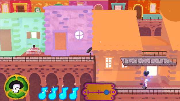
Early development mockup of Esquelito’s HUD
In the earlier version the assets didn’t contain texture that was consistent with the environment and characters found in the world of Esquelito. This is because we needed to create different iterations of the same elements quickly to test and see what worked the best. We continued to test the different UI elements until we landed on a set that worked for us and the gameplay we wanted to convey.
Additionally, while we continued to generate designs, advancement was made on the research side of things. Because the team wanted to stay true to the culture and ideals associated with Dia de los Muertos, we made sure to read and research symbolism, color palettes, and traditions so we could educate ourselves on the holiday we were looking to represent. Through this research we had the chance to discover what specific colors meant within the holiday, certain offerings and décor used for ofrendas, and what is practiced and observed on the day. These discoveries fueled the colors and imagery used in our UI, keeping a consistent visual identity.
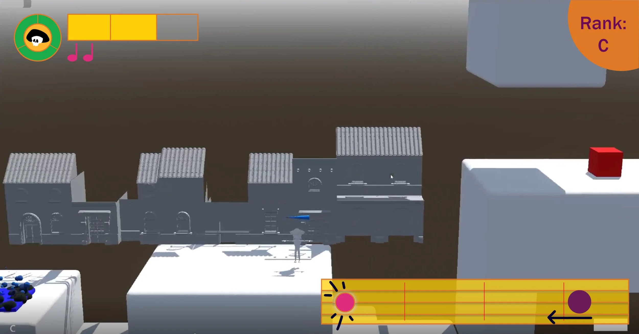
New updated and textured UI Assets in the HUD
After all this information was taken in, we put it to use. The assets gained their appropriate colors and symbolism, and texture was added to match the environment and characters that it surrounded. Our UI gained personality both relevant to the culture it represents and the art style of the game we were looking to create.
Moving forward, we are continuing to build this personality in our UI in a respectful manner and gain insight from our players on what works and what doesn’t. Powerful and significant UI doesn’t need to be in your face, but it should be practical and relevant, and this is exactly how we plan to continue our development. We at Skeletal Sync can’t wait to continue to share our progress with you, and we appreciate your support and interest in something we have been working so hard at. Stay tuned for more information on Esquelito, and in the meantime, “Spread Joy!”